
 When creating the digipak, we researched many adverts from music within our genre. We took inspiration from Tom Odell's music advert with the star image being left of the frame, which I would say worked and was successful. We also took motivation from the use of the golden stars next to the reviews. Because the star image is looking into the camera this creates a vice versa to Mulvey's quote of the 'Male Gaze' but for both genders. We also used the same font throughout the ancillaries to create synergy. This applies to Winship's theory on the 'Gaze' as the star model is looking into the camera to appeal to the TA. We decided to use different images to the digipak as we wanted a diverse range of images. Although upon reflection, I would have wanted to use an image from the digipak to have a stronger connection in synergy.

However, we did use a different font, but it was very similar, for the masthead on the advert.

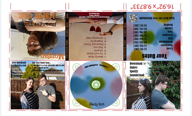
When creating the digipak, we used multiple images of the couple being playful and happy to represent the lighter side to the relationship when they had no complications. This is represented by taking the image in the sun to give the impression of light.Then on the other side of the digipak, we used an image of the couple in the shade, in a back to back pose to represent the darker side of the relationship, which is shown throughout the MV.
We also had the models and star image wearing darker colours to represent the TA (Target Audience) as it suits our genre of Indie Rock. The use of the costumes created an almost foreshadow effect on the MV as it shows it will contain the both lighter and happy sides to the relationship as well as the problems and issues.
 Upon reflection, I would have liked to used more strong, emotional colours much like when we used the colour red as it adheres to Barthes theory of symbolic and indexical signs as the colour red can symbolise love and passion but also danger and warning, which can be seen within the MV.


Some proficient evaluative phrases here Harry though i think you could develop this further and make it clear what you mean regarding the use of 'red'. Do you think this was a mistake? I don't!Look at your use of Upon reflection....
ReplyDeleteThat's better Harry - i do think the strong colours work well in this video.
ReplyDelete